2024
Mobile
B2C
Research
UX Design
Simplifying a critical workflow without compromising credibility and business rules

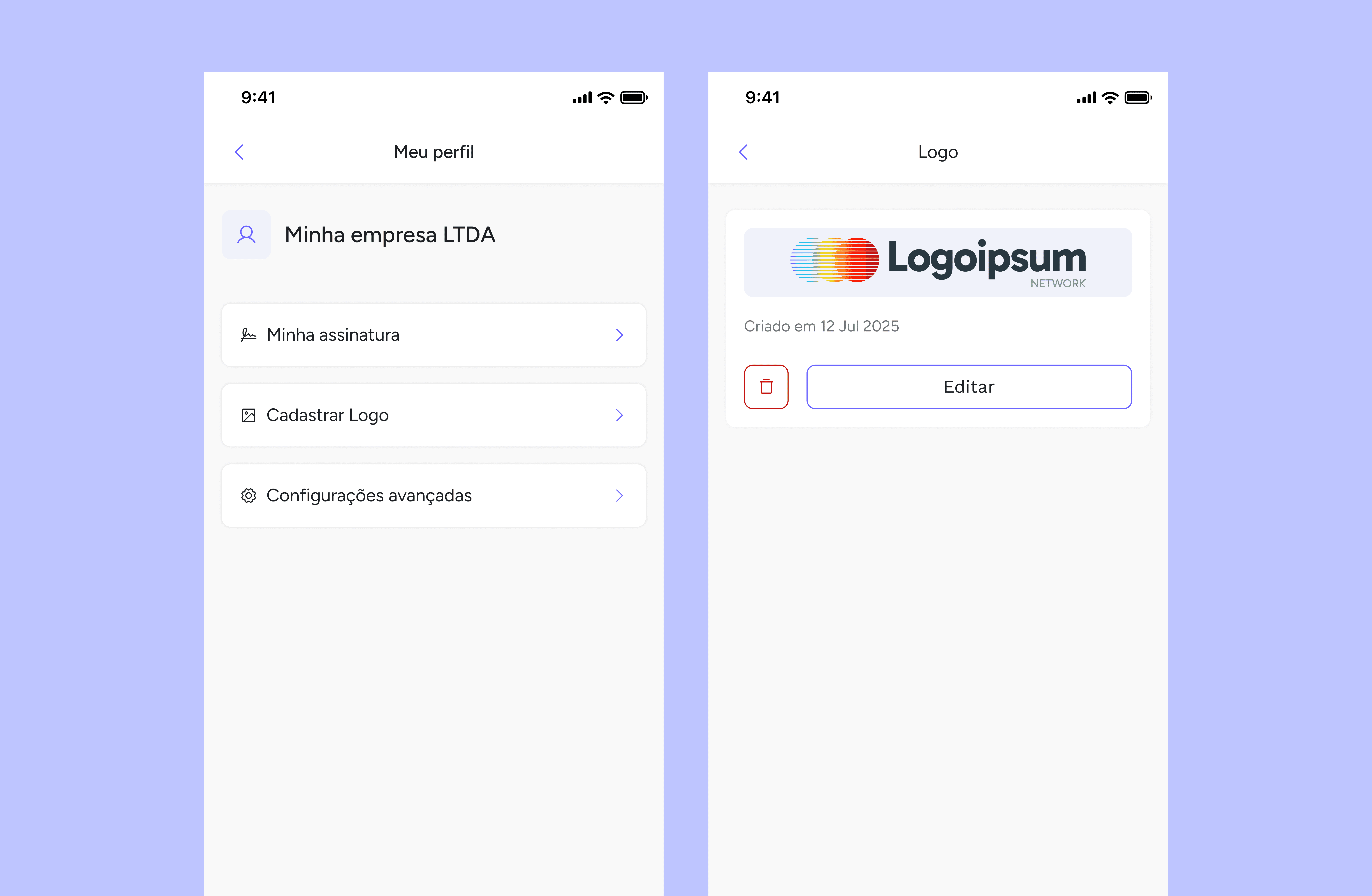

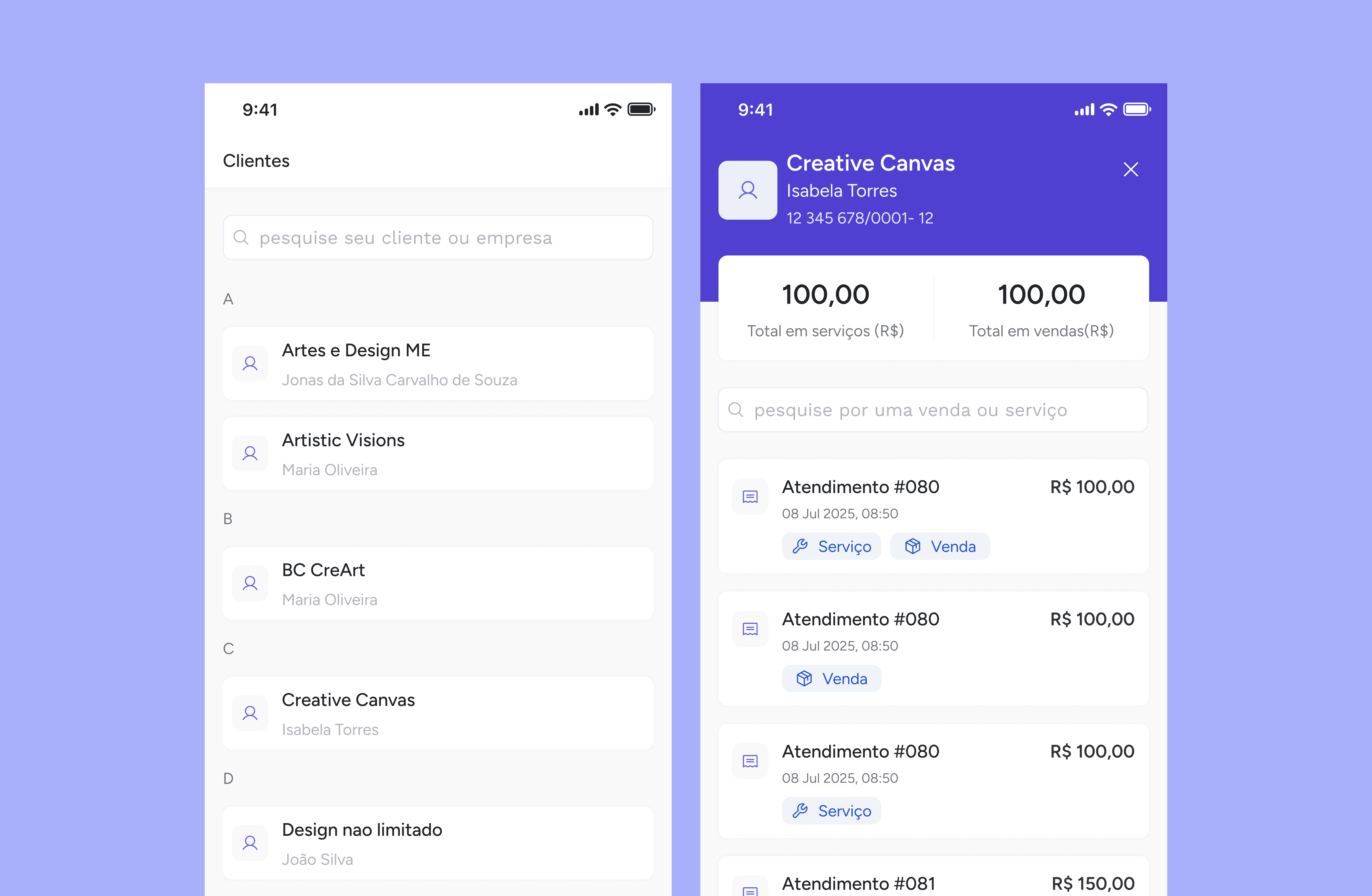

01 - About
02 - Decisions
Problem: multi-step flow increased the perception of effort in face-to-face service
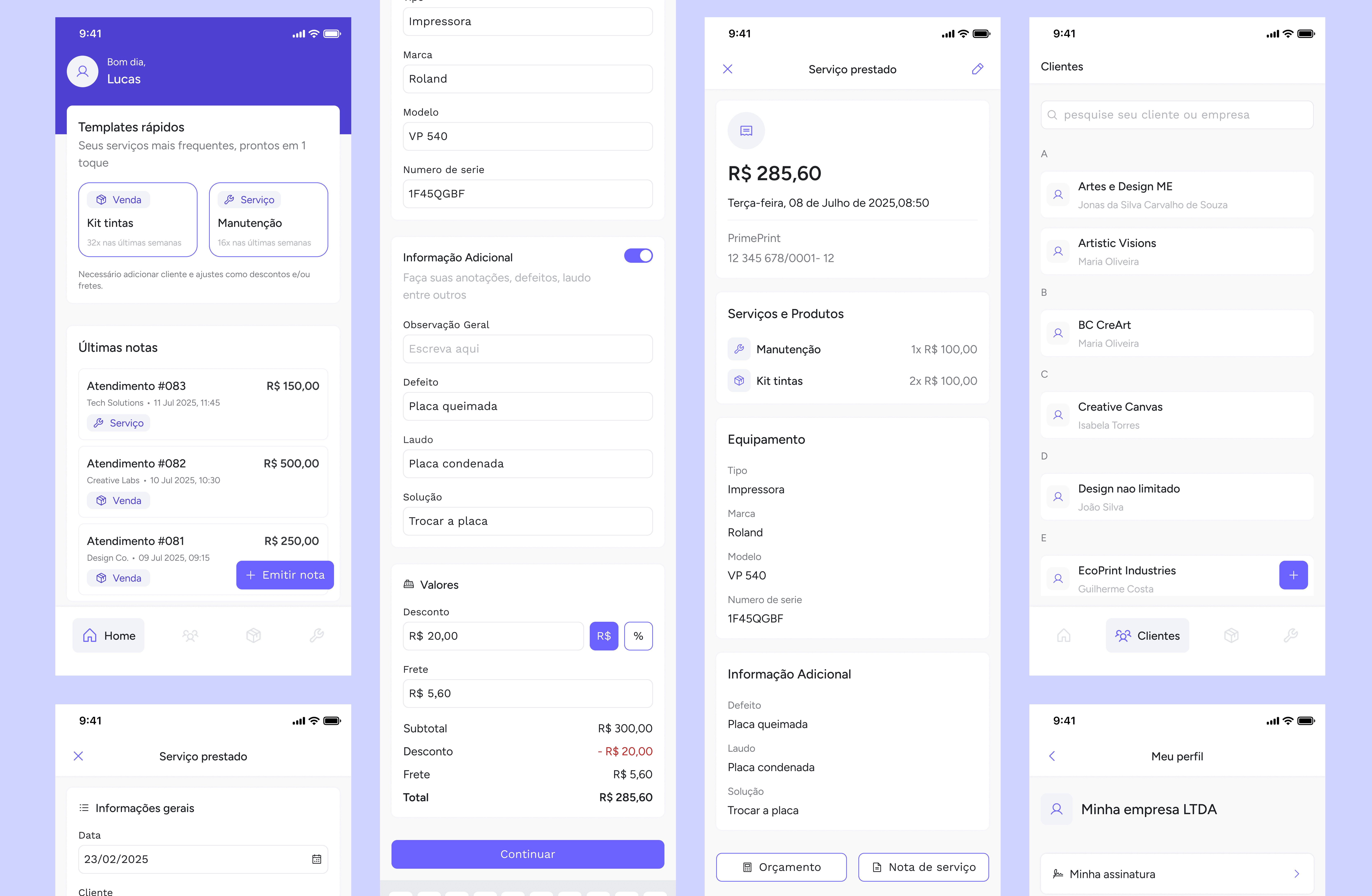
Decision: unification of the process into a single screen, organised by information blocks
Trade-off
Fewer intermediate validations in exchange for greater speed and smoother flow
Problem: the initial flow did not include the sale of products alongside services
Decision: structuring service by sessions, allowing services and products to be combined
Result
Flexibility without increasing complexity for the user
Problem: modals limited full visibility and made registration difficult
Decision: migration of the selection to a dedicated page
Impact
Better scannability, less friction and greater control over registered items
03 - Context
From the outset, the product was designed to grow without rework.
Key decisions:
Colours with sufficient contrast for visual accessibility
Readable and consistent typography
Validation in accessibility tools
Structure based on components and variables, allowing quick global adjustments
These choices made it easier, for example, to change the product's primary colour without structural impact.
04 - Impact
During testing, some sections still raised doubts. Based on this, a second version was developed, with adjustments to the information hierarchy and simplification of workflows.
Although the product is still in development and has no production metrics, the tests indicated:
greater clarity
reduced perceived effort
better flow in completing tasks


05 - Results
This project reinforced important lessons:
Simplicity is a strategic decision, not just an aesthetic choice
Designing for the real-world context of use reduces the risk of abandonment
Validating early avoids technically correct but impractical solutions.