


01 - About
02 - Decisions
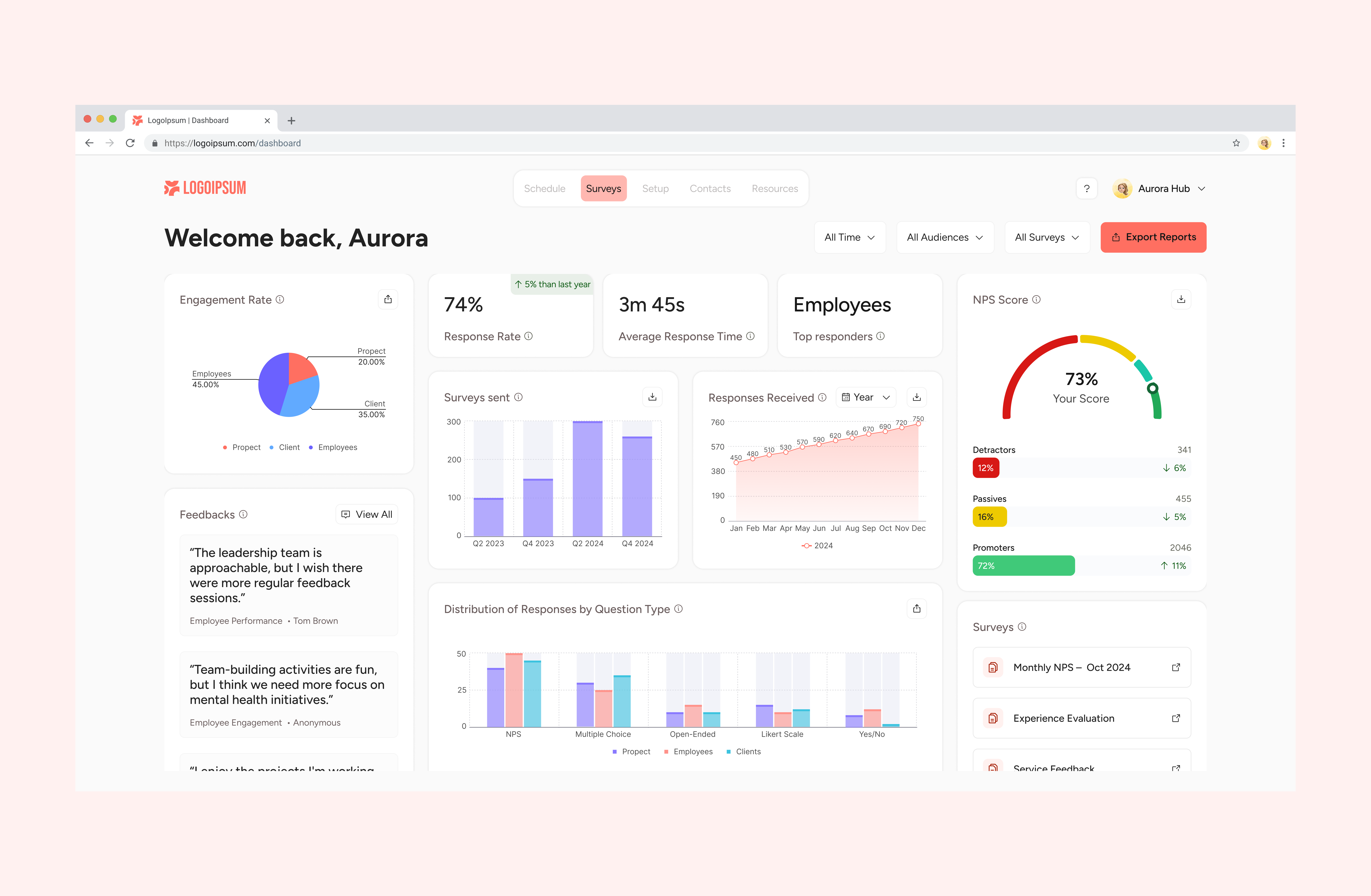
Problem: scattered information required excessive navigation to understand search performance
Decision: creation of a central dashboard with a concise overview on first access
Impact
Faster, more strategic analysis of the results
Problem: risk of overwhelming the user with excessive charts and data
Decision: prioritising clarity and quick reading, avoiding complex visualisations
Impact
A more accessible dashboard aligned with the B2B context
03 - Context
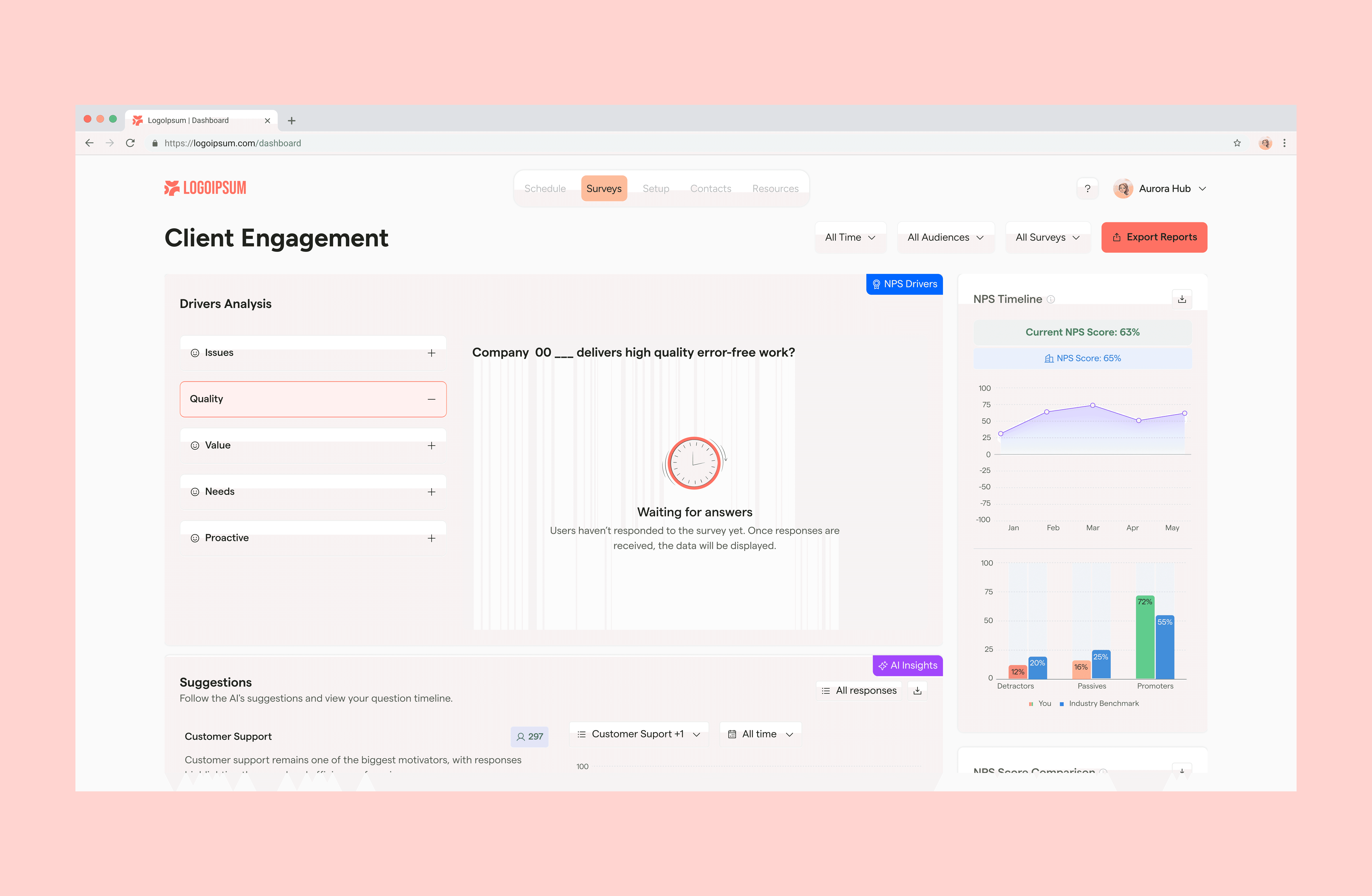
The dashboard was successfully delivered and received extremely positive feedback from the client, who highlighted the clarity of the visualisation and the strategic value of the new experience.
As a result, we were invited to continue the redesign of the platform, extending the work begun on the dashboard to other areas of the product.
04 - Impact
I worked as UX and UI Designer, collaborating directly with the project team.
I was responsible for structuring the dashboard experience, defining the information hierarchy and transforming complex data into clear visualisations, balancing information density and readability.



05 - Results
This project reinforced the importance of:
Translate complex data into clear visual narratives
Design dashboards focused on decision-making, not just metrics
Build initial solutions with evolution and scalability in mind